
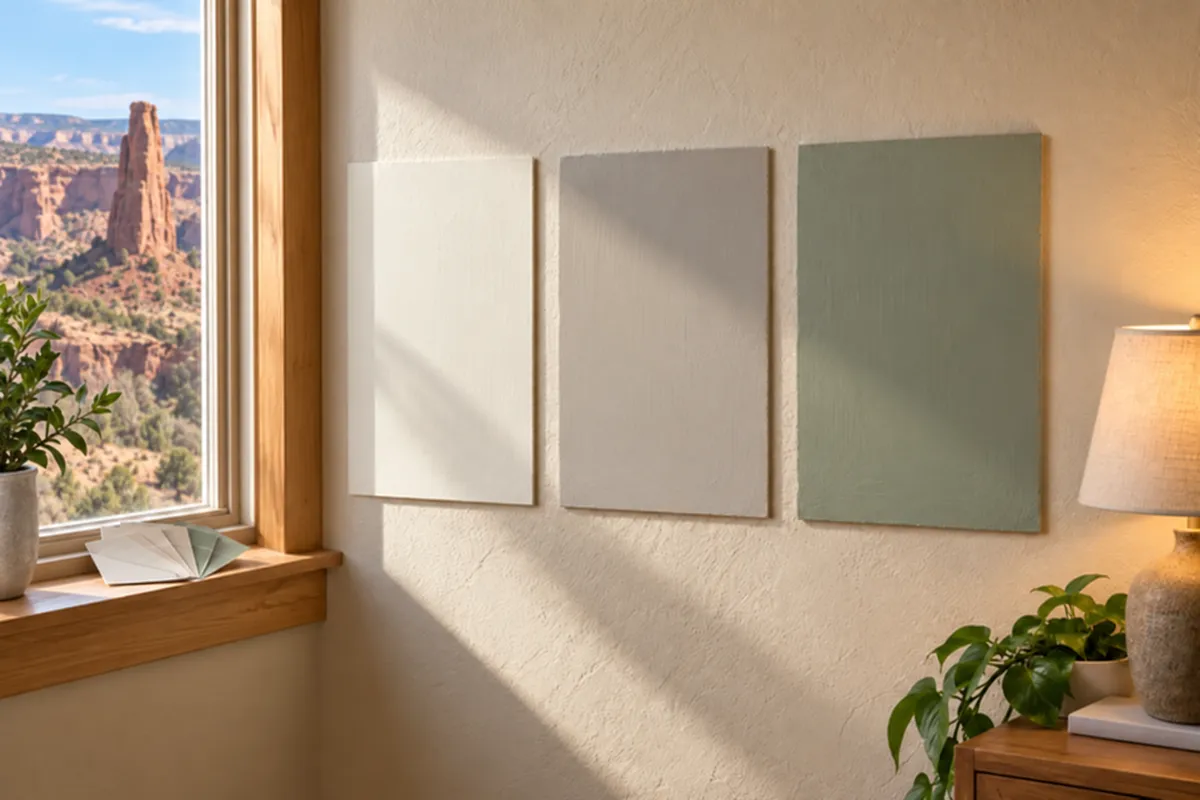
That “Perfect” Paint Color? Check It in Your Lighting.
The white looked crisp in the store. Now it looks yellow beside your kitchen cabinets. The gray you saved online? On your living room wall, it suddenly looks lavender.
Before you blame the paint, check the lighting.
For homeowners and business owners planning interior or exterior painting in Grand Junction, choosing a color means considering more than a paint chip. You need to see how that shade behaves beside your existing finishes, under your light fixtures, and during the hours you actually use the space.
A sunny living room, a covered entry, and an office with overhead LEDs can make the same color look surprisingly different. Here’s how to choose with fewer surprises.
Start With What You’re Keeping
Before collecting paint samples, take inventory of the materials that will stay: flooring, countertops, cabinets, tile, stone, and trim.
These surfaces help determine whether a new wall color feels connected to the room. A white that works with a cool gray countertop may look too stark beside cream cabinets. A beige that seems neutral alone may reveal a pink cast against another finish.
That underlying color is the undertone. Comparing similar samples makes those subtle differences easier to spot, as Sherwin-Williams explains in its undertone guide.
Try this before choosing:
Hold wall-color samples directly beside the backsplash, cabinets, and flooring.
Compare whites against your existing trim.
Keep a sample of any new flooring or countertop nearby if you’re remodeling.
If your cabinets are staying, make them part of the decision from the beginning. You should like the wall color beside them, not just on an empty stretch of drywall.
Check Which Direction Your Windows Face
Window direction offers a useful starting point for understanding a room’s light:
Main window direction | What to watch for |
|---|---|
North | Cooler light can emphasize cool undertones. Compare a warmer neutral if your first choice feels chilly. |
South | Warm daylight can bring out the warmth in creams and beiges. Check whether they become too yellow for your taste. |
East | Morning light and afternoon light differ. Evaluate the color during the hours you spend there. |
West | Late-day sunlight can intensify warm colors. Give samples an afternoon check before committing. |
These patterns follow Sherwin-Williams’ room-orientation guidance, but trees, neighboring buildings, window coverings, and roof overhangs also affect the light reaching your walls.
For a Grand Junction living room you mainly use after work, the evening test deserves more weight than a quick look before breakfast. For a home office, judge the sample from your desk during working hours.
Test Paint Samples With a Simple Routine
Narrow your choices to three candidates. For example, compare your favorite neutral with one warmer option and one slightly deeper option.
Then:
Make samples large enough to judge. Aim for approximately 2-by-2-foot painted sample boards when practical.
Apply enough paint for full coverage. Follow the product’s directions for preparation and drying. Benjamin Moore recommends at least two coats for its liquid color samples.
Move the samples. Check beside trim, near the window, and in the room’s darkest area.
Look morning, afternoon, and after dark. Use your normal lamps and overhead lighting.
View each finalist by itself. Give yourself a chance to see it without competing samples immediately beside it.
Benjamin Moore’s sampling guide also recommends movable boards and a white border to reduce interference from the existing wall color.
Record specific reactions: “too yellow beside cabinets,” “good in daylight,” or “too dark behind the sofa.” Those notes are more useful than repeatedly deciding whether you “like” a sample.
Check Your Lightbulbs Before Rejecting a Color
If a sample looks right during the day and wrong at night, look at the lighting you’re testing it under.
Bulb packaging lists color temperature in Kelvin, or K. Lower numbers generally indicate warmer light; higher numbers indicate cooler light. A 2700K bulb and a 5000K bulb can produce noticeably different impressions of the same room. The Department of Energy explains how LED color temperatures vary.
If you plan to replace fixtures or bulbs, do that before making your final paint decision. Test under the lighting you intend to keep.
Also check whether adjoining fixtures use mismatched bulbs. Warm pendants over a kitchen island and cooler lights over the perimeter counters can complicate a white-paint decision.
For a retail space or salon, color rendering matters too: how faithfully lighting reveals the colors of merchandise, finishes, and people. That is a separate consideration from whether the light looks warm or cool. DOE’s LED guide explains the distinction.
Will White Paint Make a Dark Room Brighter?
A lighter color can reflect more available light, but paint cannot supply light that isn’t there.
Look for a color’s Light Reflectance Value, or LRV, in the manufacturer’s information. Higher-LRV colors reflect more light; lower-LRV colors reflect less. Benjamin Moore identifies high light reflectance as a defining feature of many white paints.
Use that number to compare lightness—not to predict undertones.
For a dim hallway, test a soft off-white alongside your preferred white and evaluate the lighting itself. Choosing the brightest white on the rack does not guarantee the welcoming result you want.
Choose the Finish Along With the Color
Color and sheen work together. A glossy surface reflects light differently from a flat one, changing how the painted surface appears. Sherwin-Williams explains how finish affects color perception.
That matters when sunlight travels across a long wall or a fixture shines directly onto painted cabinets.
Before approving your selection, ask your painter to confirm:
The paint product and sheen for each surface.
Whether the sample represents the planned finish.
Whether a final test area is needed on the actual wall, cabinet, or siding.
Discuss cleaning needs at the same time. A busy entryway, kitchen, and quiet guest bedroom may need different performance characteristics. Choose the product for the room’s use as well as its appearance.
Choosing Exterior Paint Colors in Western Colorado
Take exterior samples outside before deciding. A color viewed at the kitchen table has not passed its exterior test.
Start with the roof, masonry, window frames, and other elements that will remain. These already contribute to the palette, a point emphasized in Benjamin Moore’s exterior color guidance.
Then evaluate the main color, trim, and accent color together.
For a home in Grand Junction, Fruita, or Palisade, a useful test includes a sunlit wall and a shaded area beneath an overhang or covered porch. Step back to the sidewalk or driveway to judge the whole combination.
For a landscape-inspired palette, consider sampling a sandstone neutral, muted sage, or warm off-white. Treat those as starting points; your roof and masonry should help determine which direction works.
Before ordering, confirm any HOA requirements and ask your painter whether the selected coating and color suit your exterior material. Check sample-product instructions, too: some color-testing paints are intended only for temporary evaluation and are not exterior finish coatings.
Commercial Paint Colors Need an Operating-Hours Test
For commercial painting in Grand Junction, evaluate colors while the business looks and functions as it normally does.
An empty storefront with the lights off gives you incomplete information. Turn on display lighting, position merchandise, and compare samples beside flooring, counters, and signage.
Make the test specific to your business:
Offices: View the color from workstations and meeting tables.
Retail stores: Check whether the wall supports or competes with merchandise.
Restaurants: Evaluate samples under the actual evening lighting settings.
Reception areas: Judge the color from the entrance and from seated eye level.
If a brand color will cover a large wall, approve a physical sample alongside your signage. A digital logo is useful direction, but the finished wall needs its own review.
Get Help Choosing Colors Before Painting Begins
A little testing can help you avoid repainting a room simply because the color looked different than expected.
XL Painting offers residential painting services in Grand Junction, including interior and exterior painting, cabinet refinishing, and color consultation. We also provide commercial interior and exterior painting for businesses across Western Colorado.
Bring your favorite samples, inspiration photos, and a list of the finishes you’re keeping. We can help you work through the choices as part of planning your project.
Ready to find a color that works in your space? Request a free estimate from XL Painting or call (970) 712-5751.